Background
Improving conversion for subscriptions
Meetup has been a dominant force in helping people stay connected and build community for over twenty years. The cornerstone of the product's success is the groups and events that event organizers pay to host and organize through the platform. I was tasked with figuring out ways to improve the conversion and experience of someone just starting out as a Meetup organizer.
- How might we improve the existing subscription flow to help increase the conversion rate for both web and apps?
- How might we better optimize the flow?
Role
Lead product and visual designer
Timeline
6 months from conception, iteration and launch
Platform
Mobile apps and web
Results
+200% increase in conversion
The redesigned experience resulted in over a +200% increase in conversions for subscriptions.
About
Organizers pay a subscription to host events.
Meetup has two primary types of users. The first is a member, someone who signs up for Meetup for free and can join groups and events. The other is an organizer who can create groups and host events in addition to joining events and groups themselves. Meetup is a platform that allows people to find and create local groups worldwide. They have a freemium model where users can join groups for free but have to pay to create their own groups. The company wanted to increase the number of users who paid for subscriptions.
Specifically, the subscription experience for organizers is a push-and-pull to ensure that there are not only people on the platform who subscribe but also that they are of substance. Several questions to help ensure this include group name, description, location, and topic areas.
Original flow
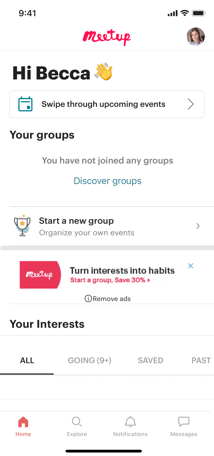
Home page
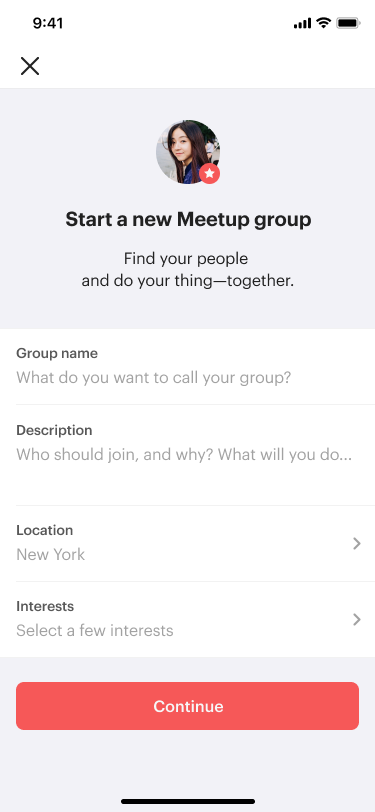
Group start
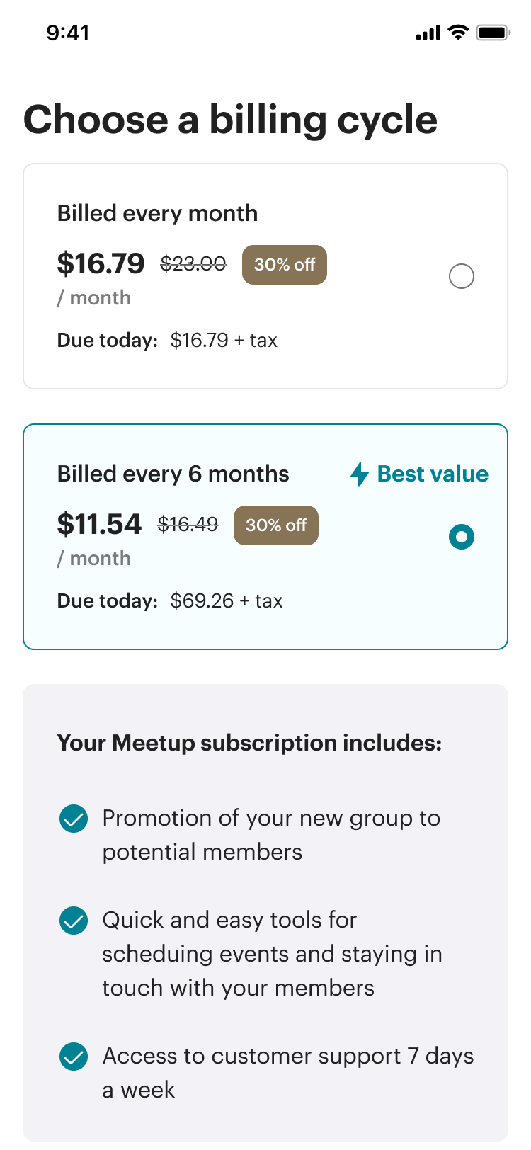
Subscription
Considering it’s a single screen before asking the user to subscribe, why are the metrics low?
Strategy
Research showed how nervous new organizers are when starting a group.
Put yourself in the shoes of someone who has just decided to start a new group. You're excited to build a community, plan events, and make new friends, but negative thoughts begin to gnaw at you.
- What if no one shows up to the events you plan?
- What if someone looks at the group name or description, and it's not enough to entice them to join your group?
After conducting user interviews, we learned that organizers were highly motivated to create their communities but nervous about the possibility of failing. They needed support and structure to start a new group to help build their confidence that they could succeed.
Competitive analysis showed almost all other experiences use a multi-step onboarding process on mobile apps.
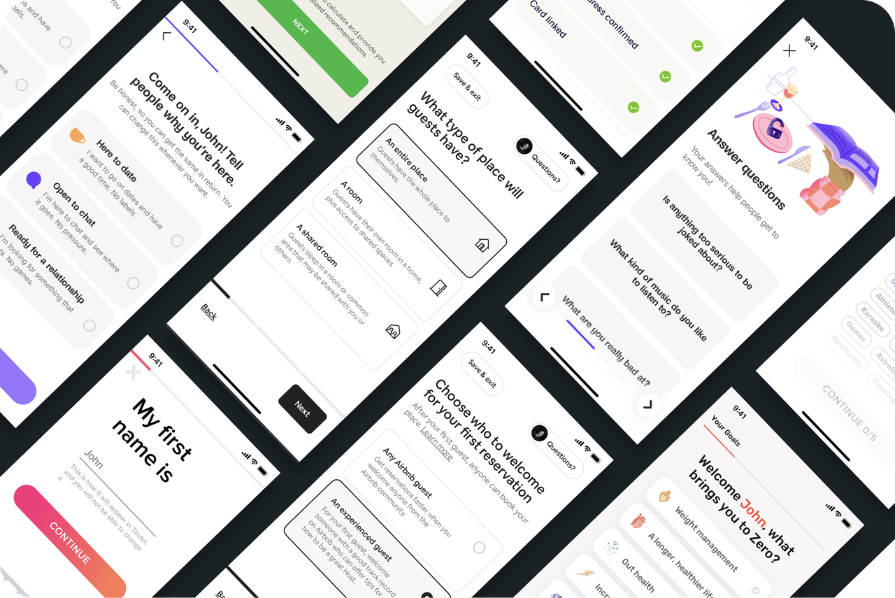
*Above images from competitive analysis for mobile apps.
For anything from onboarding, subscription, to account setup, the best practice for mobile apps is separating each task into its own screen. With the real estate on mobile being so limited, this makes a lot of sense - reduce the friction by simplifying the amount of information that needs to be input.
Reviewing the Experience
Looking at the current experience, multiple opportunities were discovered to provide support to organizers.
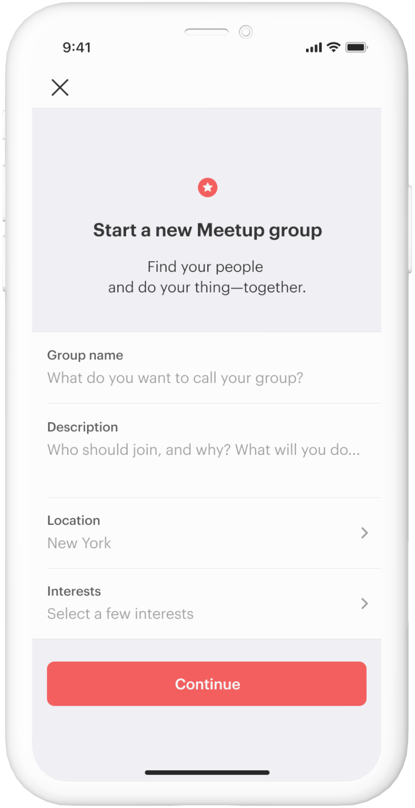
1. Design issues
- Doesn’t seem like being an organizer would be “fun”
- Unclear how many steps there are in the process
- Helper text goes away when user taps into input fields, users can easily lose track of what they’re doing
2. Inefficient framework
- Can easily lose context of actions user is taken because it’s a single screen
- Not best practice given screen real estate and friction
3. Not building confidence
- Very little support given to users other than single lines of input
- Need to consider other ways to help users go feel comfortable starting a group
#1. The design has many areas for improvement.
Becoming an organizer is fun. Organizers build a community and spend time with people in real life, and it's a rewarding experience.
The design doesn't evoke that being an organizer would be fun or inspiring but that it requires a lot of work. It's mostly gray, black, and utilitarian, opposite the sentiment we'd like to convey. On top of that, the helper text is truncated, and aspects of the copy, like "interests," are unclear.
#2. The framework for starting a group is inefficient and doesn't take into consideration common mobile design patterns.
Form entry on mobile apps usually involves multiple steps because of the limited space and the possibility of overwhelming the user with too much information.The current layout of having all of the entry fields on a single screen could be leading to the significant bounce rate by having too much friction within the experience.
#3. The current flow was not optimizing to build a user’s confidence.
After tapping the link to start a group, a user sees a single screen where they can fill out a form. There's virtually no context, and it doesn't give the user critical information, including:
- Why were these specific questions being asked?
- What would be a "good" response to the questions?
Solution On Apps
Crafting an updated flow to build users’ confidence and improve efficiency.
Original flow

Home page

Group start

Subscription
New flow
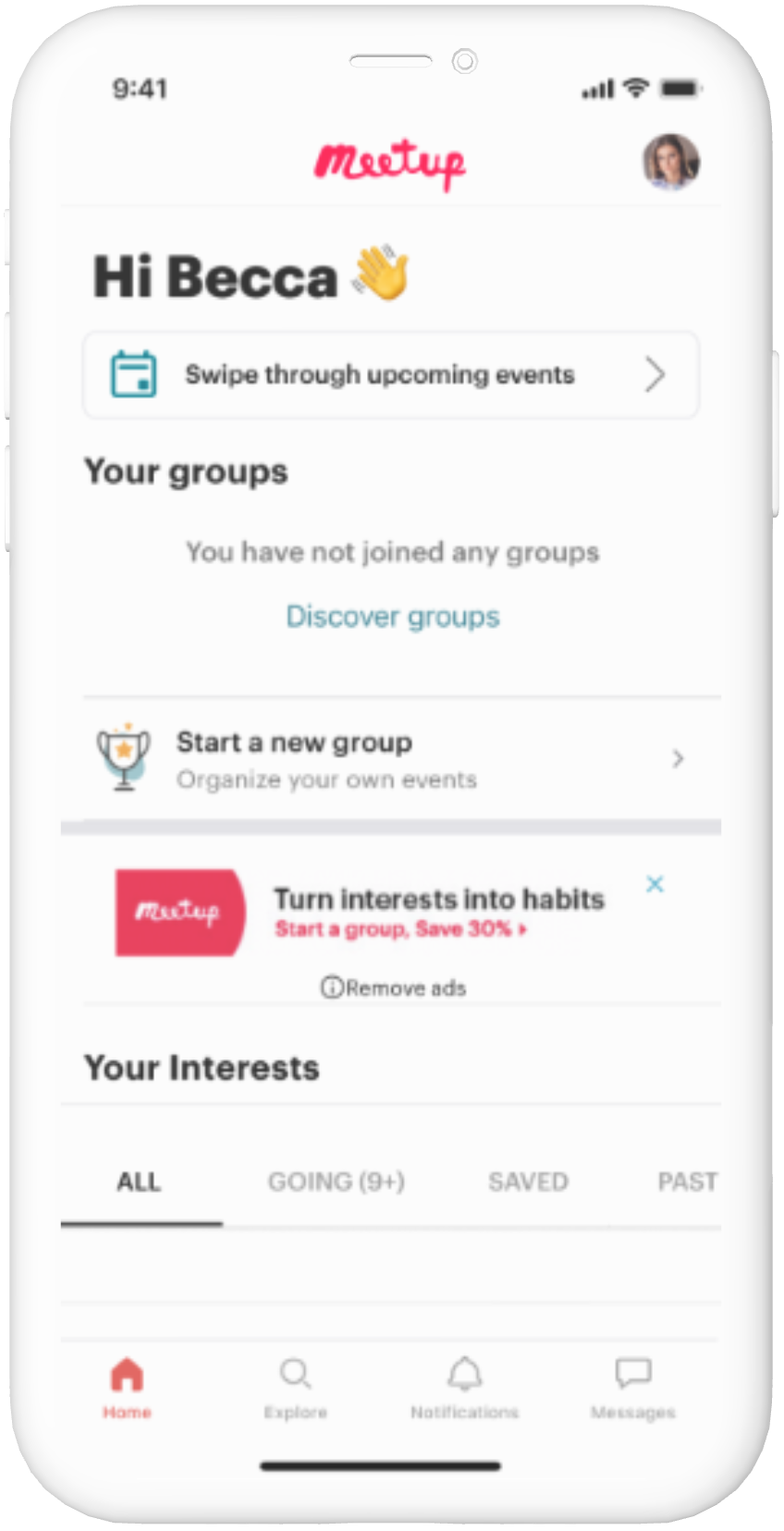
Home page
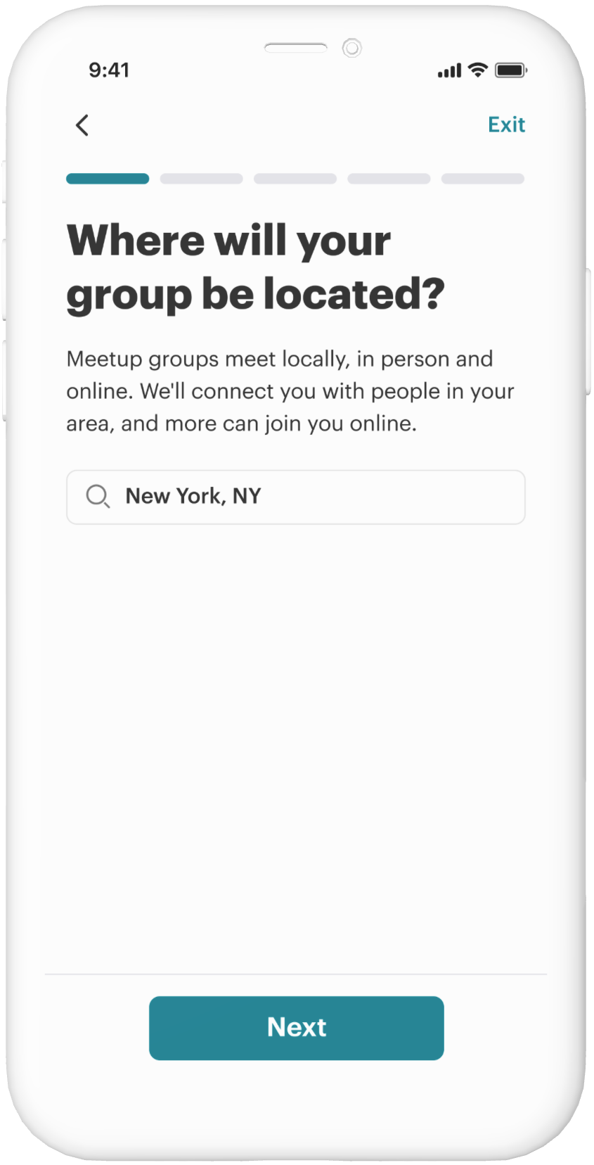
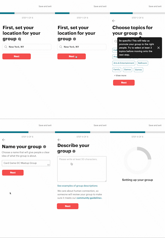
Location
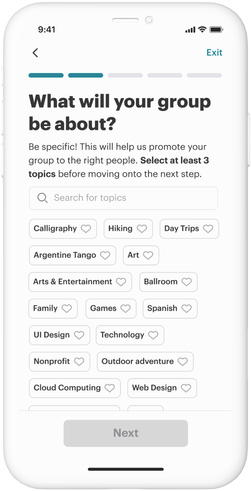
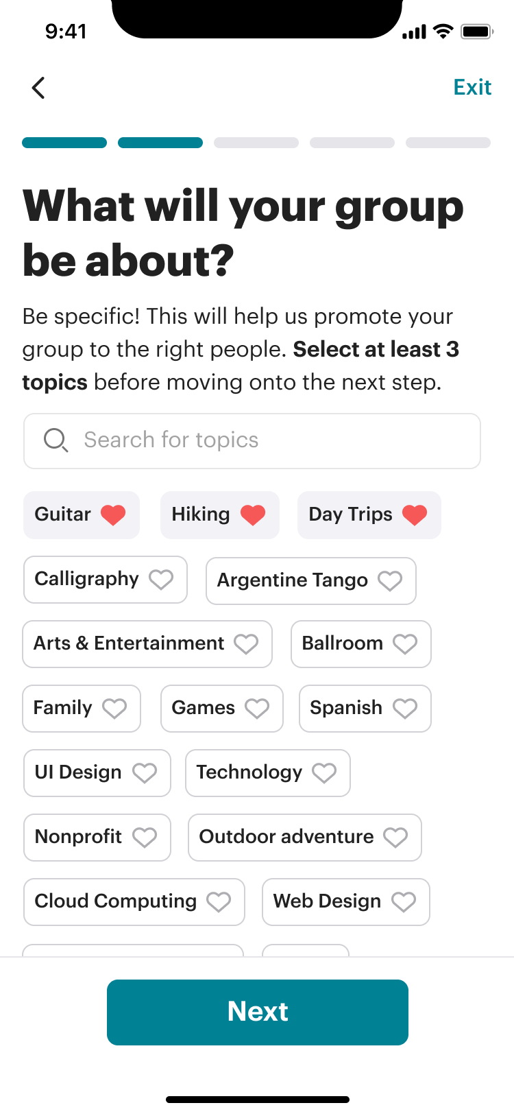
Topics
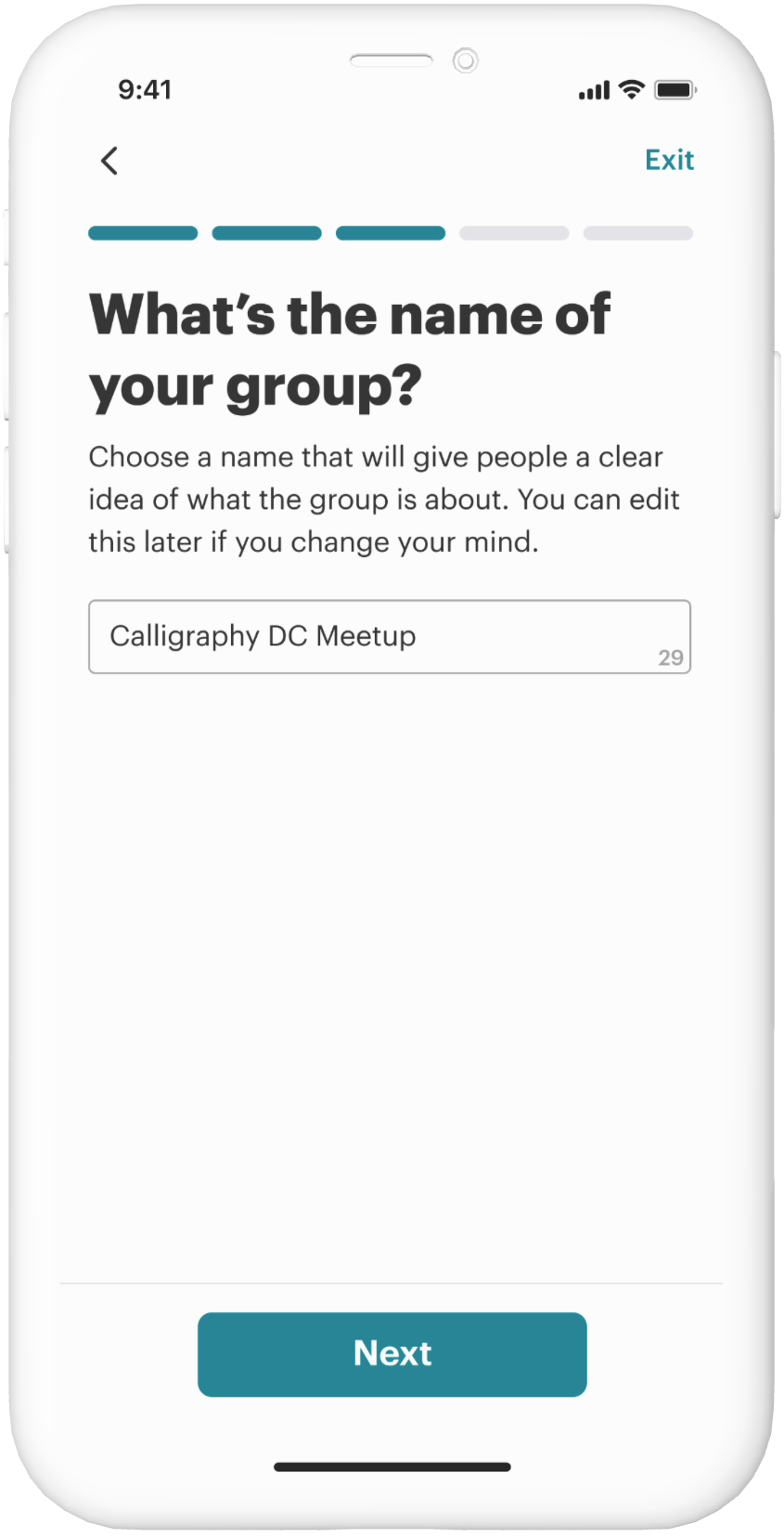
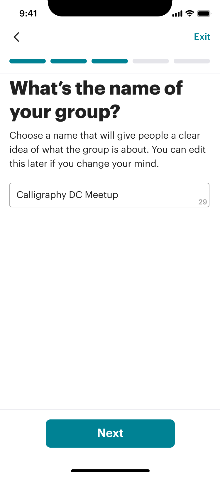
Name
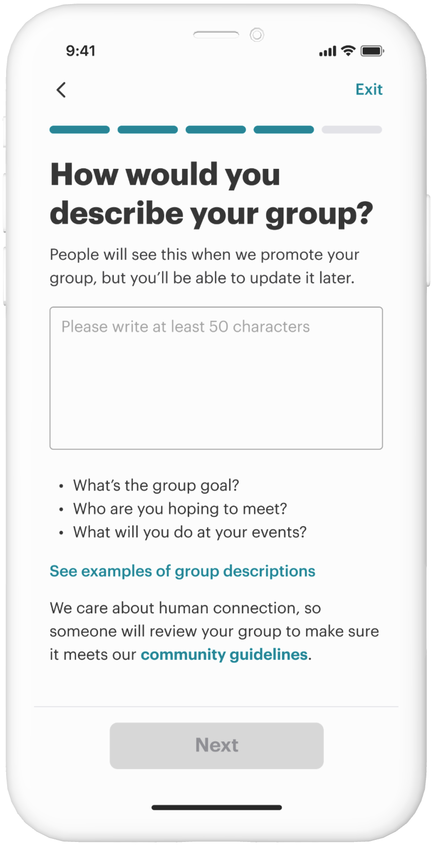
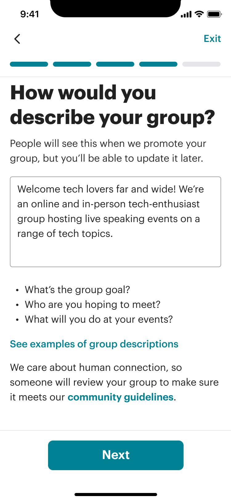
Description
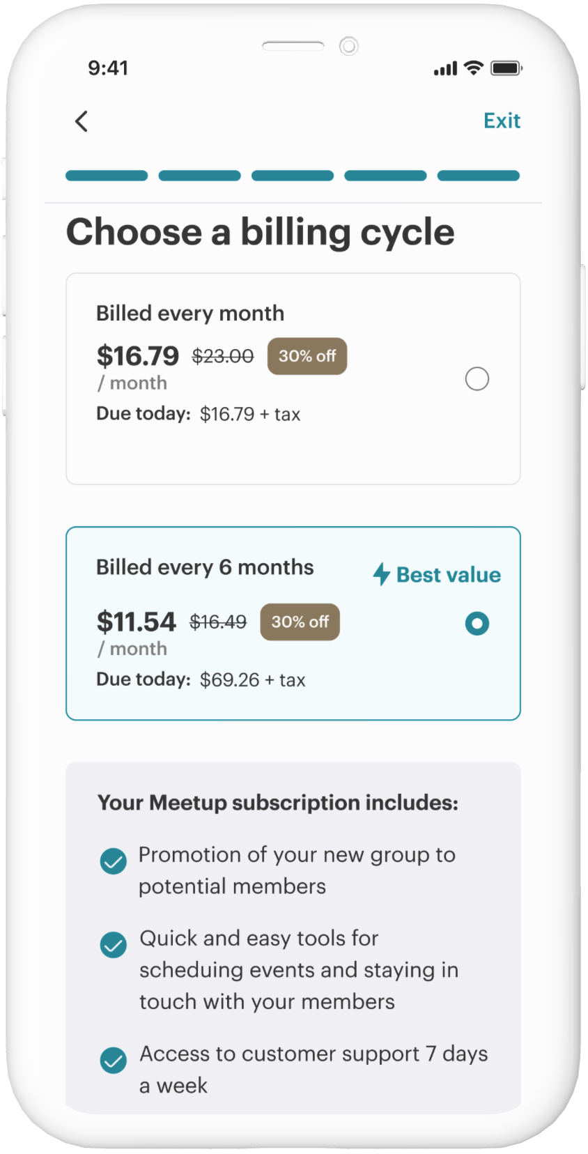
Subscription
It may seem counterintuitive, but having more steps is better for the experience than fewer ones. There’s a lot being asked of the user that showing them everything upfront is overwhelming.
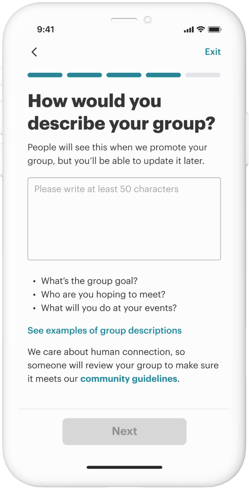
Show progress
- Each input field is given its own screen
- Progress bar to see where the user is within the process and know how many steps are left
Supportive text
- Helper text to help users understand why these questions are being asked and how they'll be used
- Questions to help users brainstorm text
Each step included a question and context for the screen's purpose. The steps are broken down this way to help users understand how each step contributed towards creating their group and building their confidence along the way.

Examples of helper text are shown throughout the various screens, allowing users to understand the context further.
Design modernization
Considering app best practices, the overall design was intended to feel more minimalistic and simpler to use despite having more steps.
Before

After

Web Before
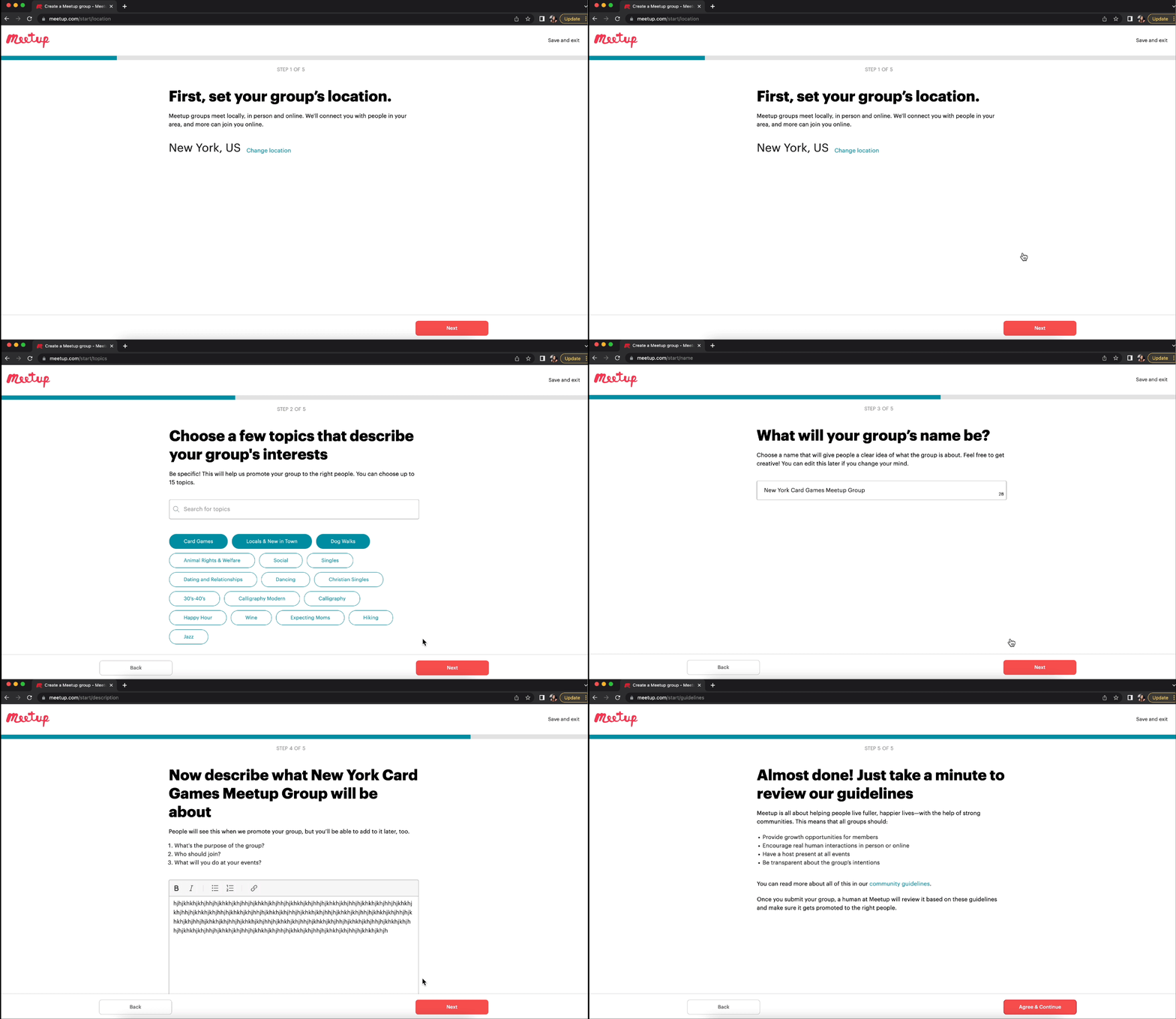
Web After

Results
Outcomes
The team ran an A/B test for apps to determine which flow converted the most users while considering other key metrics like retention and other subscriptions. This new flow overwhelmingly won over the existing experience in all categories, resulting in 100% adoption of this new experience.


