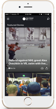
USA TODAY's VR Stories app for Android and iOS incorporates 360-degree photos and VR content into one cohesive mobile experience.
In many ways, VR was (and still is) considered experimental technology. With limited users and ever-changing hardware, UX standards and conventions have yet to be established and validated. Drawing from current best practices in two-dimensional UI served as helpful guidance, and it was exciting to discover new ideas for this medium.
Role
Lead user experience architect
Once the requirements were set based on a limited timeline and scope, I set out a plan for the user experience strategy. After surveying the virtual reality competitive landscape and completing a card sort, I reimagined the content strategy for the experience and then explored different ideas to create a new layout for the design.
Competitive analysis
Reviewing the few competitors in the VR space revealed the simplicity of our early version of the app. Reorganizing the content would bring it up to parity.
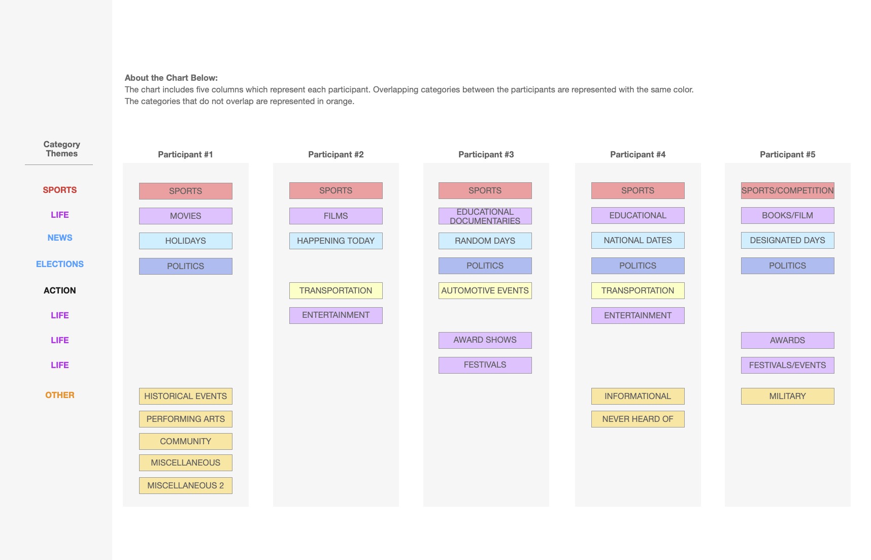
Card sort
Participants grouped current and anticipated virtual reality content into categories during a virtual open card sort on Optimal Workshop. We used these results to determine menu items/categorization for the VR Stories app.
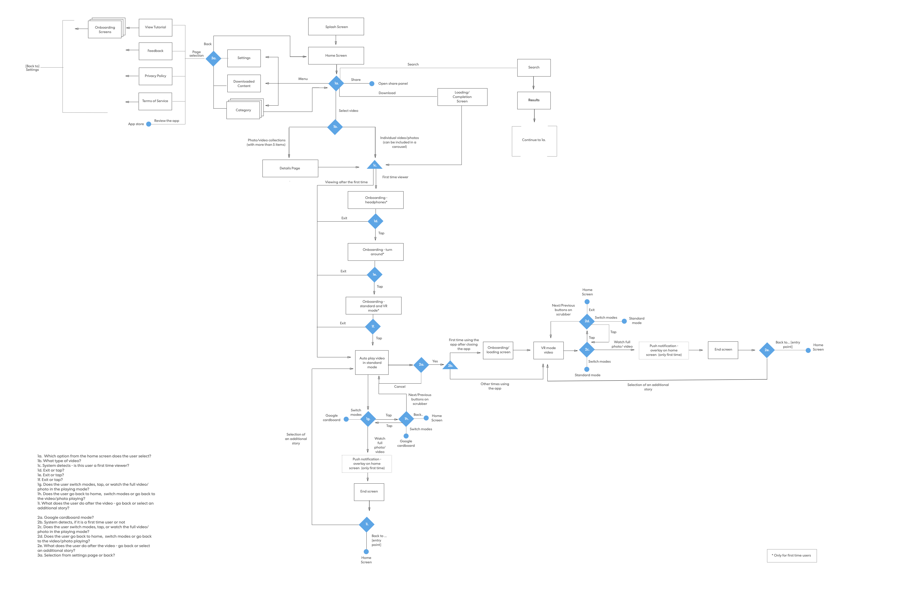
User flow
VR players have a complex user flow with several considerations (e.g., has the user viewed the content previously? Should the content auto-play? How do we get users from one point to another, considering they are wearing a Google cardboard?).
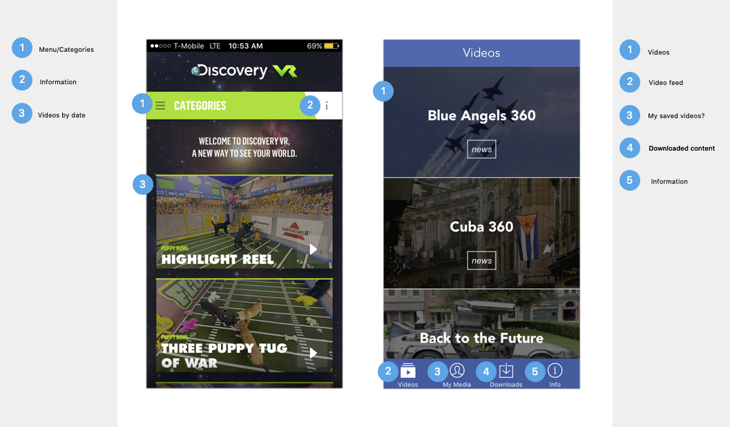
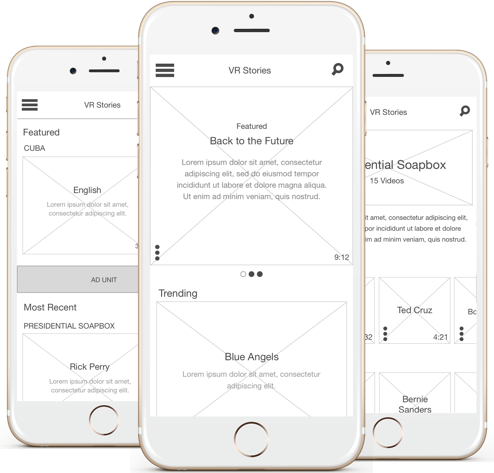
Wireframes
After surveying the virtual reality competitive landscape and completing a card sort, I reimagined the content strategy for the experience. Then, I explored different ideas to create a new design layout.
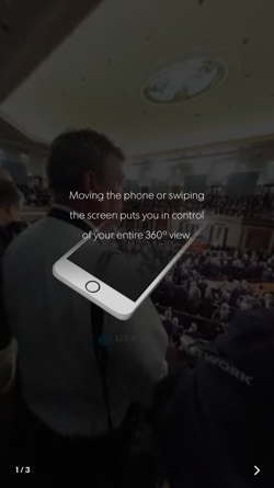
In the initial UX strategy for the app, one of the goals was to create a strong onboarding for the experience because:
- Virtual reality is still fairly new and many people are unfamiliar with it
- There is a considerable amount of virtual reality jargon.
The resulting onboarding experience provides clear explanations for how users can engage with the different parts of the app.
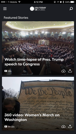
Shortening Path to Content
The original VR Stories app’s user flow required users to go through multiple steps to view the content. I changed a couple of the steps (e.g., download vs. stream) to be passive interactions and trimmed a couple of unnecessary interaction points to help users get to the content more easily.
Ability to Switch Between Content Easily
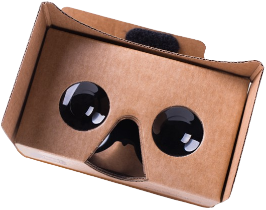
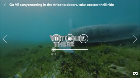
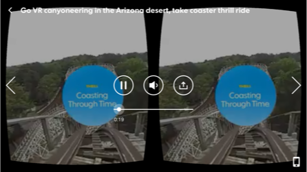
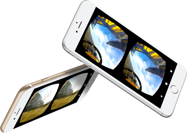
Since the app offers two primary ways to view virtual reality content, it was important for the user to transition between them seamlessly. Users can view the content via Google Cardboard or directly on their phones. Switching between these views was designed to be as easy as a click of a button.
VR Stories redesign was launched in May 2016 and has received many accolades from users.
- Beautiful app, easy to use, I would recommend it especially for the multiple ways that you can view the stories.
- I wish I could watch all news like this. Please, make more reports.
- Still awe-struck! I don't have a VR viewer yet. But watching the clips in my dark, quiet room was a pretty good indicator of what's in store for me once I get one! We live in amazing times. This is so beautifully done.